Thoughts on colour & mid century design
.jpg)
Thoughtfully experimenting with colour can elevate a space from being good, to exceptional. Colour evokes emotions and the way in which we experience our surroundings, is influenced by the colour choices we make. When a selection of hues is grouped together to form a palette, you may find that it can transport you to another place, or time.
Mid-century design often featured shades of orange, teal and chartreuse, paired with bright whites and warm timber tones of walnut, teak and oak. These unique and unexpected colour combinations were embraced and showcased in everything from homewares to upholstery and fashion. The iconic imagery of Slim Aarons, which captured all manner of elegant locales from Palm Springs to Copenhagen, shows just how prolific these colours were.
Today, it is the refined lines, minimal detailing and organic forms of Mid-Century design that continue to be widely admired. The ‘form following function’ ethos produced timeless designs that complement our contemporary spaces effortlessly. Incorporating the traditional hues of the Mid-Century era into our homes can be more difficult, as bright, saturated colours have largely been cast aside in favour of neutral colour schemes. Bringing these back into interior spaces can be a daunting task but the effect of adding colour and contrast to our spaces shouldn’t be overlooked.
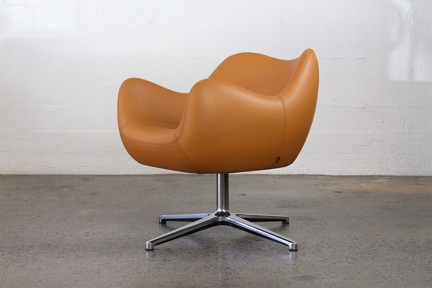
A vintage armchair presents an opportunity to experiment with colour and taking inspiration from the structure of a piece is a good place to start. A frame that celebrates the beauty of simplicity can be paired with a busier, vintage-inspired abstract print, whilst a frame featuring exposed joints or recessed detailing, could be upholstered in single colour – chartreuse velvet or rich tan leather.
The thousands of tones that sit within the gray family compliment brighter hues and can be used on walls to ‘tie together’ the colours you begin to introduce. If you find yourself wanting to still play it safe to some extent but are craving for your interior to have some individuality, consider Pantone’s selection of “new neutrals”. These are easily adaptable tones that draw on the colours found within nature, emphasizing a familiarity and warmth that resonates with us all. Click through to Pantone's piece about the new palette here.
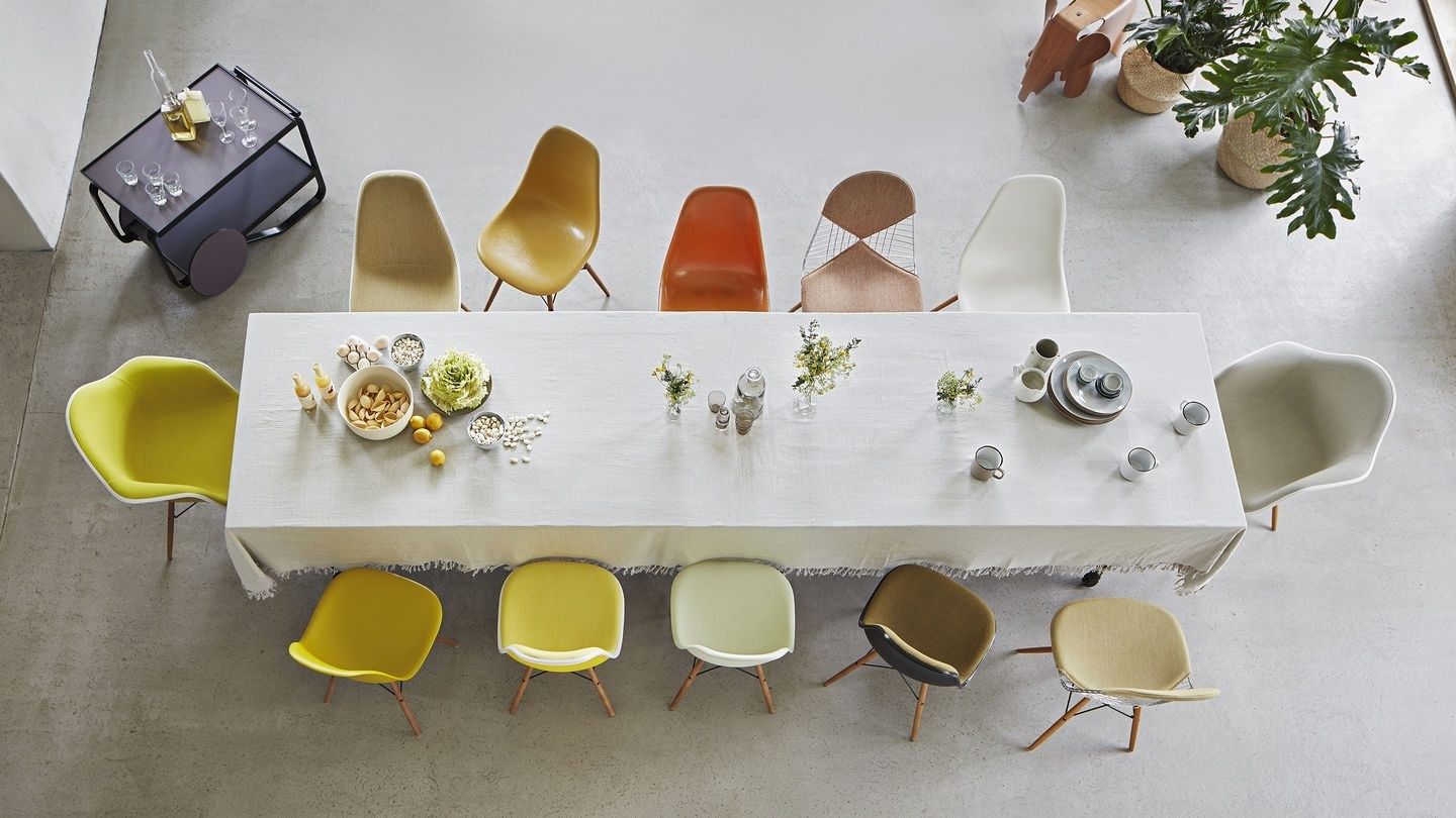
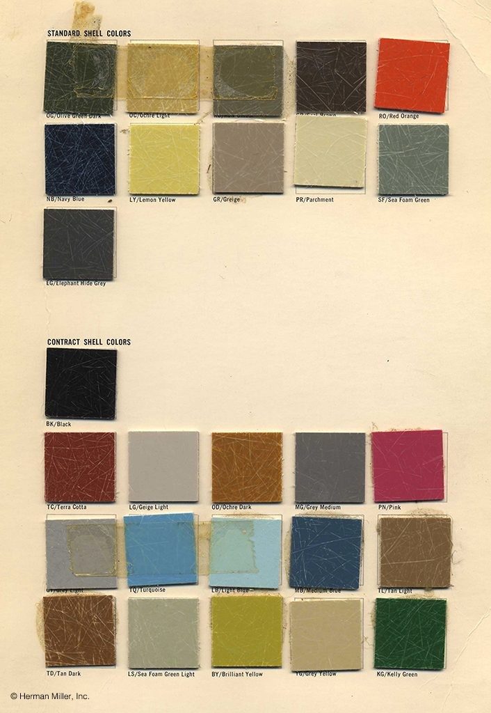
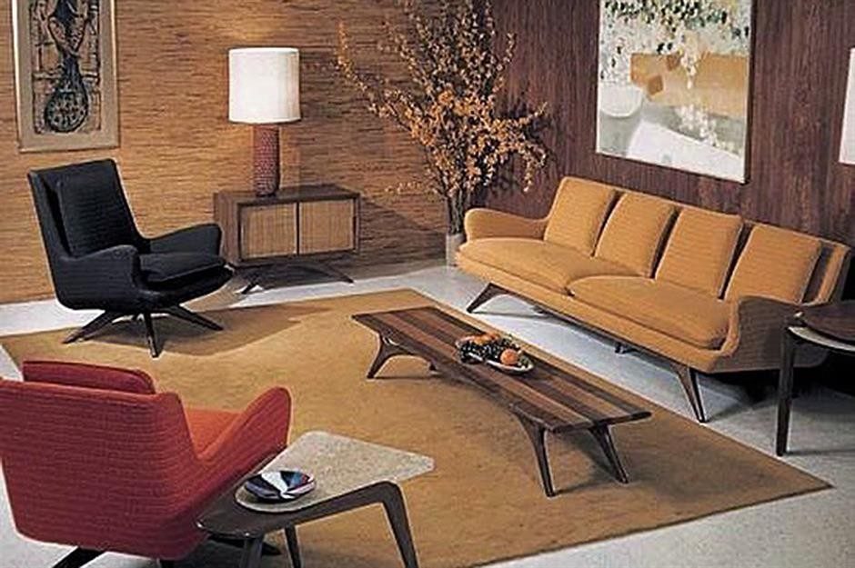
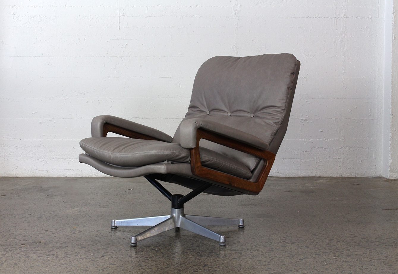
Image Credits L - R
Current Eames designs by Vitra
Vintage Herman Miller colour chart - Eames shell options
Vintage lounge room via Pinterest
Andre Vandenbeuck King armchair, Karl Erik Ekselius lounge chair, VZOR swivel chair - vintage pieces reupholstered by Karakter.